The rebranding of our natural skincare company began in 2019. We contemplated a series of questions to help determine the path forward. One key observation that came out of the process was that our philosophy of giving wasn’t clearly reflected in the brand. Our “Take Care” brand story emerged as something important we wanted our brand to represent. As the founder, I had no idea that this would become so meaningful to our community because of the circumstances that have developed in 2020.
Motivation
The reasons our branding should change were carefully considered. We went deep on many questions around our origin, values, community and industry to help decide whether to make this leap.
Process
There was a detailed process involved in changing our branding. We worked with a design firm, Fig Industries, whose values aligned with our own. A timeline with key elements was prepared and tied back to estimated costs.
Our natural body care company’s values, mission, packaging, target audience and many other things were evaluated to ensure that this was the right decision and that all appropriate updates would be made. Special thanks to Fig Industries and Rachel Whittaker for bringing focus, enthusiasm and momentum to our process.
Brand Assessment
We focused on the current branding, our natural body care company, our skincare products and our customers to determine the changes needed for the brand. We looked at our own plans, skincare competition, current and future beauty products and what our community wanted.
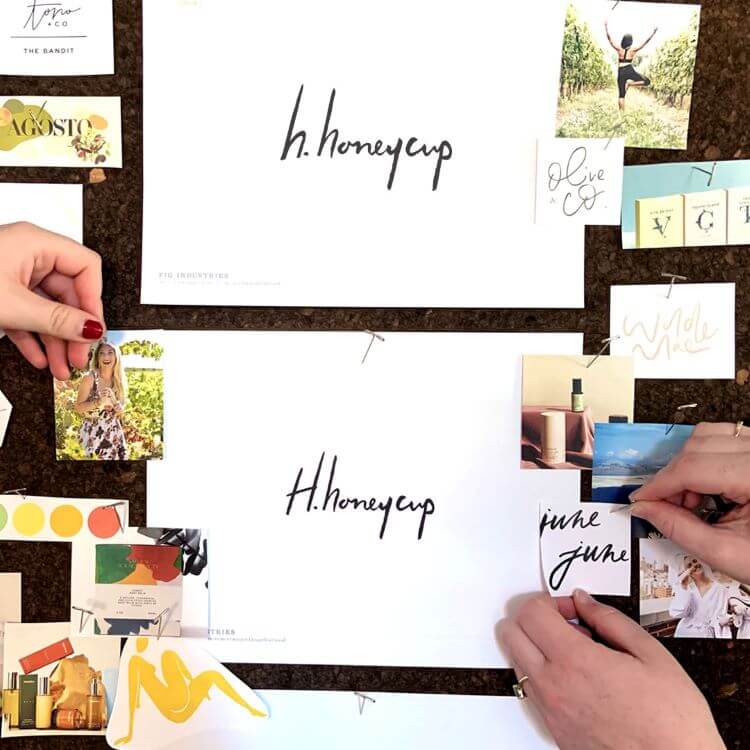
Mood Board
A mood board was key to reveal preferences on colors and design and combining them with information gained from the brand assessment. This was a way to gather information creatively. The mood board linked early ideas, the detailed brand assessment and the beginning of the new branding. Then this information was applied to our indie beauty brand to develop a new logo, new labels, and new secondary packaging. I'm happy that my love for honeysuckles and buttercups which led to our company name is part of the design. Also our support for sober living centers.
Design and Application
Once the design was selected through a review of various drafts, the process of applying it to our skincare products, website, social media, and marketing began. The new look and process has been communicated to our followers and customers because transparency is important to us and our community. We wanted everyone to be excited leading up to the launch of the new brand and be part of our journey.
Ultimately we are very happy with the changes we made which are now in the process of being communicated and implemented. Please share in our journey on LinkedIn, Facebook, Instagram, and Pinterest.
Timing
We of course did not anticipate how the world would change precisely when we were launching our new look. The first product photo shoot took place March 11, 2020. It was the last day I was out in the world before everything changed. If it was one week later, I would not have been present.
It’s so interesting that the main aspect of the brand we wanted to communicate more directly now inspires so much emotion. Our encouraging “Take Care” message fits with many of our core values including helping others with their journey, including those in recovery. Also expressing feelings, listening, and treating our bodies with respect both mentally and physically. Finally, surviving intense experiences and coming out stronger.
Our core values have been the same from the beginning. They are now shared through one simple phrase.
Take care of yourself. Take care of others.
Cindy

Cindy is the founder of H. Honeycup. She encourages self-care, a giving community and prefers a relaxed culture which translates to her plant based body care products. As a family affected by addiction, H. Honeycup donates products to those in recovery with the hope that it helps heal body and mind naturally.